Create the Application Stub
Create the application stub
In this step, we will create the stub of the application. This will include the previously mentioned components, but without any live data at this point.
We are going to create some new folders and files in the andy-pizza-shop directory. You can use the left column’s directory tree to edit these files.
-
First, press CTRL-C in the terminal in Cloud9 to stop the current server. * You can do this anytime you need to stop the server and run a command.
-
In the terminal, run the following commands:
# Change to app directory
cd ~/environment/andy-pizza-shop
# Create components folder
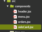
mkdir src/components
# Create new component files
touch src/components/menu.jsx
touch src/components/header.jsx
touch src/components/orders.jsx
touch src/components/sideCard.jsx
touch src/components/stores.jsx
touch src/components/comments.jsx
Verify that the new components folder is under the src folder:
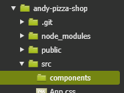
You should now have a directory structure that looks like this:
- Edit the src\index.js file and replace the contents with the following code. Then save index.js:
import React from "react";
import ReactDOM from "react-dom";
import "./index.css";
import App from "./App";
import reportWebVitals from "./reportWebVitals";
import "bootstrap/dist/css/bootstrap.min.css";

ReactDOM.render(
  <React.StrictMode>
    <App />
  </React.StrictMode>,
  document.getElementById("root")
);

// If you want to start measuring performance in your app, pass a function
// to log results (for example: reportWebVitals(console.log))
// or send to an analytics endpoint. Learn more: https://bit.ly/CRA-vitals
reportWebVitals();
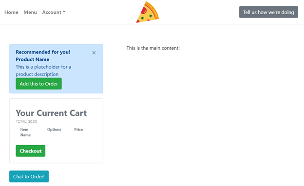
The index.js file contains the reference to the root element and any shared components. In this file, we are simply adding a reference to the bootstrap css
Use the little Copy to Clipboard icon in the upper right corner of the code blocks to make copying the code easy! 
- Edit the src\App.js file and replace the contents with the following code. Then save App.js.
import React, { Fragment } from "react";
import "./App.css";
import { Container, Row, Col } from "reactstrap";
import Header from "./components/header";
import SideCard from "./components/sideCard";

function App() {
  return (
    <Fragment>
      <Header />
      <div className="my-5 py-5">
        <Container className="px-0">
          <Row
            noGutters
            className="pt-2 pt-md-5 w-100 px-4 px-xl-0 position-relative"
          >
            <Col
              xs={{ order: 2 }}
              md={{ size: 4, order: 1 }}
              tag="aside"
              className="pb-5 mb-5 pb-md-0 mb-md-0 mx-auto mx-md-0"
            >
              <SideCard />
            </Col>

            <Col
              xs={{ order: 1 }}
              md={{ size: 7, offset: 1 }}
              tag="section"
              className="py-5 mb-5 py-md-0 mb-md-0"
            >
              This is the main content!
            </Col>
          </Row>
        </Container>
      </div>
    </Fragment>
  );
}

export default App;
The App.js file contains the top-level code for our application. In this file, we are adding the layout of the single page application.
- Edit src\components\header.jsx and replace the contents with the following code. Then save header.jsx
import React from "react";

import {
  Container,
  Row,
  Col,
  Button,
  Navbar,
  Nav,
  NavbarBrand,
  NavLink,
  NavItem,
  UncontrolledDropdown,
  DropdownToggle,
  DropdownMenu,
  DropdownItem,
} from "reactstrap";

const Header = (props) => {
  const currentUser = props.userName;
  return (
    <header>
      <Navbar
        fixed="top"
        color="light"
        light
        expand="xs"
        className="border-bottom border-gray bg-white"
        style={{ height: 80 }}
      >
        <Container>
          <Row noGutters className="position-relative w-100 align-items-center">
            <Col className="d-none d-lg-flex justify-content-start">
              <Nav className="mrx-auto" navbar>
                {currentUser ? (
                  <NavItem className="d-flex align-items-center">
                    <NavLink className="font-weight-bold" href="/">
                      Welcome, {currentUser}!
                    </NavLink>
                  </NavItem>
                ) : null}

                <NavItem className="d-flex align-items-center">
                  <NavLink className="font-weight-bold" href="/">
                    Home
                  </NavLink>
                </NavItem>

                <NavItem
                  className="d-flex align-items-center"
                  onClick={() => props.onHandleOrder()}
                >
                  <NavLink className="font-weight-bold btn">Menu</NavLink>
                </NavItem>

                <UncontrolledDropdown
                  className="d-flex align-items-center"
                  nav
                  inNavbar
                >
                  <DropdownToggle className="font-weight-bold" nav caret>
                    Account
                  </DropdownToggle>
                  <DropdownMenu right>
                    <DropdownItem
                      className="font-weight-bold text-secondary text-uppercase"
                      header
                      disabled
                    >
                      My Account
                    </DropdownItem>
                    <DropdownItem divider />
                    {currentUser ? <DropdownItem>Profile</DropdownItem> : null}
                    {currentUser ? (
                      <DropdownItem onClick={() => props.onHandleStores()}>
                        Store Admin
                      </DropdownItem>
                    ) : null}
                    {currentUser ? (
                      <DropdownItem onClick={() => props.onHandleHistory()}>
                        Order History
                      </DropdownItem>
                    ) : null}
                    {currentUser ? (
                      <DropdownItem
                        onClick={() =>
                          props.onHandleLogout ? props.onHandleLogout() : null
                        }
                      >
                        Logout
                      </DropdownItem>
                    ) : (
                      <DropdownItem onClick={() => props.onHandleLogin()}>
                        Login
                      </DropdownItem>
                    )}
                  </DropdownMenu>
                </UncontrolledDropdown>
              </Nav>
            </Col>

            <Col className="d-flex justify-content-xs-start justify-content-lg-center">
              <NavbarBrand
                className="d-inline-block p-0"
                href="/"
                style={{ width: 80 }}
              >
                <img
                  src="https://jah-lex-workshop-2018.s3.amazonaws.com/mob302/images/0001.png"
                  alt="logo"
                  className="position-relative img-fluid"
                />
              </NavbarBrand>
            </Col>

            <Col className="d-none d-lg-flex justify-content-end">
              <Button
                className="info"
                onClick={() =>
                  props.onHandleReview ? props.onHandleReview() : null
                }
              >
                Tell us how we're doing
              </Button>
            </Col>
          </Row>
        </Container>
      </Navbar>
    </header>
  );
};
export default Header;
The header.jsx file contains the top navigation header links.
- Edit the src\components\sideCard.jsx file and replace the contents with the following code. Then save sideCard.js:
import React, { Component, Fragment } from "react";
import {
  Button,
  UncontrolledAlert,
  Card,
  CardBody,
  CardTitle,
  CardSubtitle,
  Container,
  Row,
  Col,
} from "reactstrap";

class SideCard extends Component {
  state = {};

  render() {
    return (
      <Fragment>
        <UncontrolledAlert color="primary" className="d-none d-lg-block">
          <strong>Recommended for you!</strong>
          <br />
          <Fragment>
            <b>Product Name</b>
            <br></br>
            This is a placeholder for a product description
            <br></br>
            <Button color="success">Add this to Order</Button>
          </Fragment>
        </UncontrolledAlert>

        <Card>
          <CardBody>
            <CardTitle className="h3 mb-2 pt-2 font-weight-bold text-secondary">
              Your Current Cart
            </CardTitle>
            <CardSubtitle
              className="text-secondary mb-2 font-weight-light text-uppercase"
              style={{ fontSize: "0.8rem" }}
            >
              Total: $0.00
            </CardSubtitle>
            <div
              className="text-secondary mb-4"
              style={{ fontSize: "0.75rem" }}
            >
              <Container>
                <Row className="font-weight-bold">
                  <Col>Item Name</Col>
                  <Col>Options</Col>
                  <Col>Price</Col>
                </Row>
              </Container>
            </div>
            <Button color="success" className="font-weight-bold">
              Checkout
            </Button>
          </CardBody>
        </Card>

        <br />
        <Button color="info">Chat to Order!</Button>
      </Fragment>
    );
  }
}

export default SideCard;
The sideCard.jsx file displays the shopping cart items.
- Now, we are finished with adding code for the application stub. In the terminal, run npm start. Once it is ready, return to the preview window for your application and you should see the skeleton of Andy’s Pizza and Sub web app.
You can now continue adding functionality in the next step.